 e8fbfb14c1
Add coexistence checks to all enqueue methods to prevent loading
both React and Grid.js assets simultaneously.

Changes:
- ReactAdmin.php: Only enqueue React assets when ?react=1
- Init.php: Skip Grid.js when React active on admin pages
- Form.php, Coupon.php, Access.php: Restore classic assets when ?react=0
- Customer.php, Product.php, License.php: Add coexistence checks

Now the toggle between Classic and React versions works correctly.

Co-authored-by: Claude Opus 4.7 <noreply@anthropic.com>
337 lines
10 KiB
Markdown
337 lines
10 KiB
Markdown
<p align="center"><img src ="https://github.com/bokuweb/re-resizable/blob/master/logo.png?raw=true" /></p>
|
|
|
|
<p align="center">📏 A resizable component for React.</p>
|
|
|
|
<p align="center"><img src="https://github.com/bokuweb/re-resizable/workflows/Continuous%20Integration/badge.svg" alt="Build Status" />
|
|
<a href="https://www.npmjs.com/package/re-resizable">
|
|
<img src="https://img.shields.io/npm/v/re-resizable.svg" alt="Build Status" /></a>
|
|
<a href="https://www.npmjs.com/package/re-resizable">
|
|
<img src="https://img.shields.io/npm/dm/re-resizable.svg" /></a>
|
|
<a href="https://renovatebot.com/">
|
|
<img src="https://img.shields.io/badge/renovate-enabled-brightgreen.svg" /></a>
|
|
<a href="https://github.com/prettier/prettier">
|
|
<img src="https://img.shields.io/badge/styled_with-prettier-ff69b4.svg" /></a>
|
|
</p>
|
|
|
|
## Table of Contents
|
|
|
|
- [Screenshot](#Screenshot)
|
|
- [Live Demo](#live-demo)
|
|
- [Storybook](#storybook)
|
|
- [CodeSandbox](#codesandbox)
|
|
- [Install](#install)
|
|
- [Usage](#usage)
|
|
- [Props](#props)
|
|
- [Instance API](#instance-api)
|
|
- [updateSize(size: { width: number | string, height: number | string }): void](#updateSize-void)
|
|
- [Test](#test)
|
|
- [Related](#related)
|
|
|
|
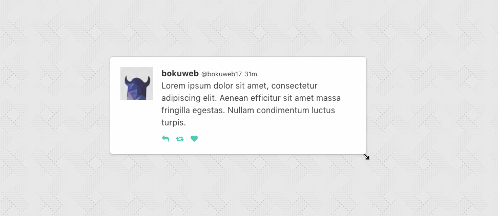
## Screenshot
|
|
|
|
|
|
|
|
## Live Demo
|
|
|
|
### Storybook
|
|
|
|
[Storybook](http://bokuweb.github.io/re-resizable/)
|
|
|
|
### CodeSandbox
|
|
|
|
[](https://codesandbox.io/s/xp9p7272m4)
|
|
[CodeSandbox](https://codesandbox.io/s/xp9p7272m4)
|
|
[CodeSandbox(TypeScript)](https://codesandbox.io/s/1vwo2p4l64)
|
|
[CodeSandbox(With hooks)](https://codesandbox.io/s/blissful-joliot-d3unx)
|
|
|
|
## Install
|
|
|
|
```sh
|
|
$ npm install --save re-resizable
|
|
```
|
|
|
|
## Usage
|
|
|
|
### Example with `defaultSize`
|
|
|
|
```javascript
|
|
import { Resizable } from 're-resizable';
|
|
|
|
<Resizable
|
|
defaultSize={{
|
|
width: 320,
|
|
height: 200,
|
|
}}
|
|
>
|
|
Sample with default size
|
|
</Resizable>
|
|
```
|
|
|
|
If you only want to set the width, you can do so by providing just the width property.
|
|
The height property will automatically be set to auto, which means it will adjust 100% of its parent's height:
|
|
|
|
```javascript
|
|
import { Resizable } from 're-resizable';
|
|
|
|
<Resizable
|
|
defaultSize={{
|
|
width: 320
|
|
}}
|
|
>
|
|
Sample with default size
|
|
</Resizable>
|
|
```
|
|
### Example with `size`
|
|
|
|
If you use `size` props, please manage state by yourself.
|
|
|
|
```javascript
|
|
import { Resizable } from 're-resizable';
|
|
|
|
<Resizable
|
|
size={{ width: this.state.width, height: this.state.height }}
|
|
onResizeStop={(e, direction, ref, d) => {
|
|
this.setState({
|
|
width: this.state.width + d.width,
|
|
height: this.state.height + d.height,
|
|
});
|
|
}}
|
|
>
|
|
Sample with size
|
|
</Resizable>
|
|
```
|
|
|
|
## Props
|
|
|
|
#### `defaultSize?: { width?: (number | string), height?: (number | string) };`
|
|
|
|
Specifies the `width` and `height` that the dragged item should start at.
|
|
For example, you can set `300`, `'300px'`, `50%`.
|
|
If both `defaultSize` and `size` omitted, set `'auto'`.
|
|
|
|
`defaultSize` will be ignored when `size` set.
|
|
|
|
#### `size?: { width?: (number | string), height?: (number | string) };`
|
|
|
|
The `size` property is used to set the size of the component.
|
|
For example, you can set `300`, `'300px'`, `50%`.
|
|
|
|
Use `size` if you need to control size state by yourself.
|
|
|
|
#### `className?: string;`
|
|
|
|
The `className` property is used to set the custom `className` of a resizable component.
|
|
|
|
#### `style?: { [key: string]: string };`
|
|
|
|
The `style` property is used to set the custom `style` of a resizable component.
|
|
|
|
#### `minWidth?: number | string;`
|
|
|
|
The `minWidth` property is used to set the minimum width of a resizable component. Defaults to 10px.
|
|
|
|
It accepts viewport as well as parent relative units. For example, you can set `300`, `50%`, `50vw` or `50vh`.
|
|
|
|
Same type of values can be applied to `minHeight`, `maxWidth` and `maxHeight`.
|
|
|
|
#### `minHeight?: number | string;`
|
|
|
|
The `minHeight` property is used to set the minimum height of a resizable component. Defaults to 10px.
|
|
|
|
#### `maxWidth?: number | string;`
|
|
|
|
The `maxWidth` property is used to set the maximum width of a resizable component.
|
|
|
|
#### `maxHeight?: number | string`;
|
|
|
|
The `maxHeight` property is used to set the maximum height of a resizable component.
|
|
|
|
#### `grid?: [number, number];`
|
|
|
|
The `grid` property is used to specify the increments that resizing should snap to. Defaults to `[1, 1]`.
|
|
|
|
#### `gridGap?: [number, number];`
|
|
|
|
The `gridGap` property is used to specify any gaps between your grid cells that should be accounted for when resizing. Defaults to `[0, 0]`.
|
|
The value provided for each axis will always add the grid gap amount times grid cells spanned minus one.
|
|
|
|
#### `snap?: { x?: Array<number>, y?: Array<number> };`
|
|
|
|
The `snap` property is used to specify absolute pixel values that resizing should snap to. `x` and `y` are both optional, allowing you to only include the axis you want to define. Defaults to `null`.
|
|
|
|
#### `snapGap?: number`
|
|
|
|
The `snapGap` property is used to specify the minimum gap required in order to move to the next snapping target. Defaults to `0` which means that snap targets are always used.
|
|
|
|
#### `resizeRatio?: number | [number, number];`
|
|
|
|
The `resizeRatio` property is used to set the number of pixels the resizable component scales by compared to the number of pixels the mouse/touch moves. Defaults to `1` (for a 1:1 ratio). The number set is the left side of the ratio, `2` will give a 2:1 ratio.
|
|
|
|
For [number, number] means [resizeRatioX, resizeRatioY], more precise control.
|
|
|
|
#### `lockAspectRatio?: boolean | number;`
|
|
|
|
The `lockAspectRatio` property is used to lock aspect ratio.
|
|
Set to `true` to lock the aspect ratio based on the initial size.
|
|
Set to a numeric value to lock a specific aspect ratio (such as `16/9`).
|
|
If set to numeric, make sure to set initial height/width to values with correct aspect ratio.
|
|
If omitted, set `false`.
|
|
|
|
#### `lockAspectRatioExtraWidth?: number;`
|
|
|
|
The `lockAspectRatioExtraWidth` property enables a resizable component to maintain an aspect ratio plus extra width.
|
|
For instance, a video could be displayed 16:9 with a 50px side bar.
|
|
If omitted, set `0`.
|
|
|
|
#### `lockAspectRatioExtraHeight?: number;`
|
|
|
|
The `lockAspectRatioExtraHeight` property enables a resizable component to maintain an aspect ratio plus extra height.
|
|
For instance, a video could be displayed 16:9 with a 50px header bar.
|
|
If omitted, set `0`.
|
|
|
|
#### `bounds?: ('window' | 'parent' | HTMLElement);`
|
|
|
|
Specifies resize boundaries.
|
|
|
|
#### `boundsByDirection?: boolean;`
|
|
|
|
By default max dimensions based on left and top element position.
|
|
Width grow to right side, height grow to bottom side.
|
|
Set `true` for detect max dimensions by direction.
|
|
For example: enable `boundsByDirection` when resizable component stick on right side of screen and you want resize by left handler;
|
|
|
|
`false` by default.
|
|
|
|
#### `handleStyles?: HandleStyles;`
|
|
|
|
The `handleStyles` property is used to override the style of one or more resize handles.
|
|
Only the axis you specify will have its handle style replaced.
|
|
If you specify a value for `right` it will completely replace the styles for the `right` resize handle,
|
|
but other handle will still use the default styles.
|
|
|
|
#### `handleClasses?: HandleClassName;`
|
|
|
|
The `handleClasses` property is used to set the className of one or more resize handles.
|
|
|
|
#### `handleComponent?: HandleComponent;`
|
|
|
|
The `handleComponent` property is used to pass a React Component to be rendered as one or more resize handle. For example, this could be used to use an arrow icon as a handle..
|
|
|
|
#### `handleWrapperStyle?: { [key: string]: string };`
|
|
|
|
The `handleWrapperStyle` property is used to override the style of resize handles wrapper.
|
|
|
|
#### `handleWrapperClass?: string;`
|
|
|
|
The `handleWrapperClass` property is used to override the className of resize handles wrapper.
|
|
|
|
#### `enable?: ?Enable | false;`
|
|
|
|
The `enable` property is used to set the resizable permission of a resizable component.
|
|
|
|
The permission of `top`, `right`, `bottom`, `left`, `topRight`, `bottomRight`, `bottomLeft`, `topLeft` direction resizing.
|
|
If omitted, all resizer are enabled.
|
|
If you want to permit only right direction resizing, set `{ top:false, right:true, bottom:false, left:false, topRight:false, bottomRight:false, bottomLeft:false, topLeft:false }`.
|
|
|
|
#### `onResizeStart?: ResizeStartCallBack;`
|
|
|
|
`ResizeStartCallBack` type is below.
|
|
|
|
```javascript
|
|
type ResizeStartCallback = (
|
|
e: SyntheticMouseEvent<HTMLDivElement> | SyntheticTouchEvent<HTMLDivElement>,
|
|
dir: ResizableDirection,
|
|
refToElement: HTMLDivElement,
|
|
) => void;
|
|
```
|
|
|
|
Calls when resizable component resize start.
|
|
|
|
#### `onResize?: ResizeCallback;`
|
|
|
|
#### `scale?: number`;
|
|
|
|
The `scale` property is used in the scenario where the resizable element is a descendent of an element using css scaling (e.g. - `transform: scale(0.5)`).
|
|
|
|
#### `as?: string | React.ComponentType`;
|
|
|
|
By default the `Resizable` component will render a `div` as a wrapper. The `as` property is used to change the element used.
|
|
|
|
### Basic
|
|
|
|
`ResizeCallback` type is below.
|
|
|
|
```javascript
|
|
type ResizeCallback = (
|
|
event: MouseEvent | TouchEvent,
|
|
direction: ResizableDirection,
|
|
refToElement: HTMLDivElement,
|
|
delta: NumberSize,
|
|
) => void;
|
|
```
|
|
|
|
Calls when resizable component resizing.
|
|
|
|
#### `onResizeStop?: ResizeCallback;`
|
|
|
|
`ResizeCallback` type is below.
|
|
|
|
```javascript
|
|
type ResizeCallback = (
|
|
event: MouseEvent | TouchEvent,
|
|
direction: ResizableDirection,
|
|
refToElement: HTMLDivElement,
|
|
delta: NumberSize,
|
|
) => void;
|
|
```
|
|
|
|
Calls when resizable component resize stop.
|
|
|
|
## Instance API
|
|
|
|
#### * `updateSize(size: { width: number | string, height: number | string }): void`
|
|
|
|
Update component size.
|
|
|
|
`grid`, `snap`, `max/minWidth`, `max/minHeight` props is ignored, when this method called.
|
|
|
|
- for example
|
|
|
|
```javascript
|
|
class YourComponent extends Component {
|
|
|
|
// ...
|
|
|
|
update() {
|
|
this.resizable.updateSize({ width: 200, height: 300 });
|
|
}
|
|
|
|
render() {
|
|
return (
|
|
<Resizable ref={c => { this.resizable = c; }}>
|
|
example
|
|
</Resizable>
|
|
);
|
|
}
|
|
|
|
// ...
|
|
}
|
|
```
|
|
|
|
## Contribute
|
|
|
|
If you have a feature request, please add it as an issue or make a pull request.
|
|
|
|
If you have a bug to report, please reproduce the bug in [CodeSandbox](https://codesandbox.io/s/ll587k677z) to help us easily isolate it.
|
|
|
|
## Test
|
|
|
|
``` sh
|
|
npm test
|
|
```
|
|
|
|
## Related
|
|
|
|
- [react-rnd](https://github.com/bokuweb/react-rnd)
|
|
- [react-sortable-pane](https://github.com/bokuweb/react-sortable-pane)
|